Tips
Colour Psychology: Choosing Wall Colours That Set the Mood
The Tehila Maison Team · February 15, 2026 · 8 min read
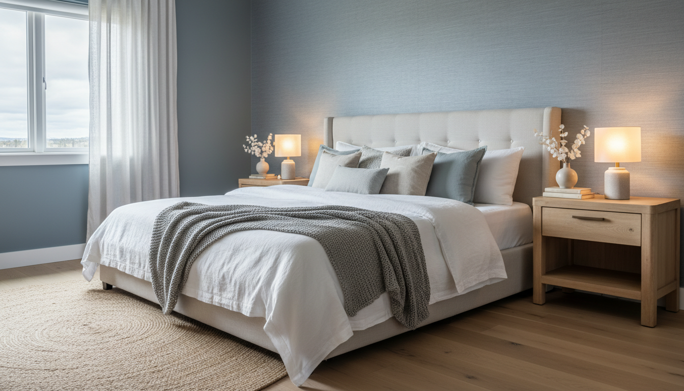
Every colour tells a story. Walk into a room painted in deep navy blue and you'll instinctively feel a sense of calm sophistication. Step into a space bathed in warm terracotta and you'll feel grounded, earthy, embraced. This isn't coincidence - it's colour psychology, and understanding it is one of the most powerful tools in an interior designer's arsenal.
The Science Behind Colour and Emotion - Research in environmental psychology has consistently shown that colour affects our mood, behaviour, and even our physiological responses. Warm colours (reds, oranges, yellows) stimulate the nervous system, increasing heart rate and energy levels. Cool colours (blues, greens, purples) have the opposite effect, promoting relaxation and lowering blood pressure. Neutral tones (whites, greys, beiges) create a sense of balance and openness. These responses are deeply ingrained - partly cultural, partly biological - and they should inform every colour decision you make in your home.
Blue: The Tranquil Anchor - Blue is consistently rated as the world's favourite colour, and in interiors, it's the go-to for bedrooms, bathrooms, and any space where relaxation is the priority. Pale sky blues create an airy, spacious feel. Mid-tone blues like denim or cornflower bring warmth and personality. Deep navy and midnight blue create dramatic, cocooning spaces that feel luxurious and intimate. In our experience, blue wallpapers are the most requested for master bedrooms - and for good reason.
Green: Nature's Reset Button - Green is the colour of nature, growth, and renewal. It sits at the centre of the visible spectrum, making it the easiest colour for the human eye to process - which is why green rooms feel inherently restful. Sage and olive greens are having a major moment in Australian interiors, bringing a sophisticated earthiness that pairs beautifully with natural timber and brass accents. Emerald and forest greens make bold, jewel-toned statements in formal living rooms and dining spaces.
Warm Neutrals: The New White - Pure white walls are giving way to warmer alternatives - cream, linen, greige (grey-beige), and warm putty tones. These colours retain the brightness and openness of white while adding depth and warmth that prevents a space from feeling clinical or cold. They're also far more forgiving of imperfections and changing light conditions. Our Warm Collection wallpapers are designed around this palette, offering subtle textures and tonal variations that bring neutral walls to life.
Red and Terracotta: Energy and Warmth - Red is the most stimulating colour, associated with passion, energy, and appetite (which is why so many restaurants use it). In residential settings, full-strength red can be overwhelming, but terracotta, rust, and burnt sienna offer the warmth and energy of red in a more liveable form. These earthy reds are perfect for living rooms, kitchens, and dining areas where you want to encourage conversation and connection.
Dark and Moody: The Cocooning Effect - There's a growing movement toward dark, enveloping wall colours - charcoal, deep plum, midnight green, and near-black. Far from making rooms feel smaller, dark walls in well-lit spaces create a sense of depth and intimacy that's incredibly appealing. The key is balancing dark walls with adequate lighting (both natural and artificial), lighter furnishings, and reflective surfaces like mirrors and metallic accents.
Room-by-Room Recommendations - For bedrooms, lean toward cool blues, soft greens, or warm neutrals that promote rest. For living rooms, consider warm neutrals, sage green, or deep navy for a sophisticated gathering space. Kitchens and dining areas benefit from warm, appetite-stimulating tones - terracotta, warm white, or soft yellow. Home offices perform best in muted greens or blues that aid concentration without causing drowsiness. Bathrooms can handle bolder choices - deep teal, blush pink, or dramatic black - because you spend shorter periods there.
Testing Before Committing - Never choose a wall colour from a small paint chip or a screen image. Colours look dramatically different depending on the light in your specific room, the time of day, and the other colours and materials around them. We always recommend viewing materials in person or booking a consultation so our team can help you choose with confidence.
Colour is one of the most affordable and impactful ways to transform your home. By understanding the psychology behind your choices, you can create spaces that don't just look beautiful - they feel exactly the way you want them to. Explore our colour-curated collections at The Tehila Maison, or book a consultation for personalised colour advice.